Love To Love... Hand Pulled Screenprint
Love To Love... Hand Pulled Screenprint
Oli Fowler Art
14 in stock
FREE UK SHIPPING FOR ALL SCREENPRINTS!
Couldn't load pickup availability
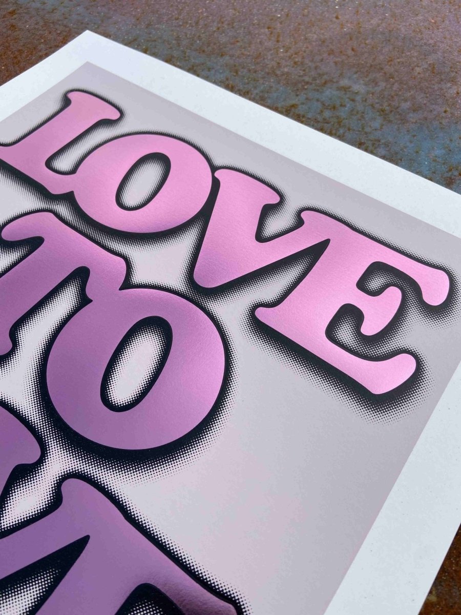
Sometimes the simplest statements hit hardest. Love To Love — three words that don't need explanation, don't need context, just need to exist in the world.
This series started with the idea that good typography doesn't shout. It sits there, confident, doing its job. Hand-pulled screenprint lets you feel that confidence — the weight of real ink on proper paper, the slight variations that prove a human made this, not a machine.
Love To Love... Series - Five 2-layer screenprints, each finished with metallic hot foil stamping. The same message, five different moods. Pink for the romantics. Green for the naturals. Blue for the thinkers. Yellow for the optimists. Lilac for the dreamers.
The process matters here. Two screen layers build the foundation — registration marks, squeegee pressure, the ritual of pulling each print by hand. Then the foil stamping. Hot metal die, metallic transfer, that satisfying press that adds dimension typography alone can't achieve. The foil catches light differently throughout the day. Morning coffee, afternoon sun, evening lamp — the same words, shifting emphasis.
Details:
- 2-layer screen print with metallic hot foil stamp
- Limited edition of 50 per colour
- 400 x 400mm square format
- 298gsm Loop Birch recycled paper
- Signed and numbered
- Sold unframed
298gsm Loop Birch recycled paper holds the ink weight these deserve. Not too smooth, not too rough. Absorbent enough for rich colour saturation, substantial enough to frame properly. Each sheet cut square, each registration checked by eye.
Fifty prints per colour. That's it. When they're gone, they're gone. No reprints, no variants, no artist proofs released later. Edition sizes mean something here.
The Typography:
Clean sans-serif, scaled to fill the square format without overwhelming it. Spacing that breathes. Letter forms that work at distance and up close. This isn't about showing off — it's about getting out of the message's way.
Perfect for:
Bedrooms where you wake up to intention. Studios where you need reminding why you're there. Living spaces that believe in directness. Works solo or collect the series — five colours, same energy, different expressions.
Care & Keeping:
Frame with UV-protective glass. Keep away from direct sunlight and damp. The foil stamping is durable but treat it with respect. These are made to last decades, not months.
This is for people who believe words matter. Who want their walls to mean something. Who back makers, not marketing departments. Simple as that.